2018 Design Trends
As our last two Design Trends Guides were read by more than 1MILLION people and translated in Russian and Chinese, we’ve put together another amazing Trend Guide for the year to come.
In the past year many new and talented designers arise on Behance. We are glad to present some of the best works this wonderful community has to offer. Enjoy 2017 was a bold year in design, with vibrant colors, daring typography, amazing motion graphics, with brave tones “moving away from edgy startups into the mainstream”
Ragged Edge . This amazing year left us with a lot of inspiring design that can be seen across all areas of branding, digital design and motion graphics. With big brands switching their brand identity to a fresh and modern approach, all media will follow, using the potential of vivid colors to increase their conversion rates. With so many bold trends coming out this year, it’s time to release your creativity, so let’s reveal the best trends in graphic design that will be
absolute hits in 2018
.
01.
Brave, Vibrant Colors
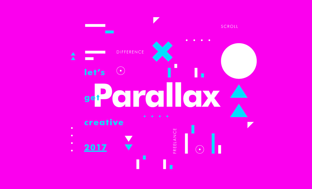
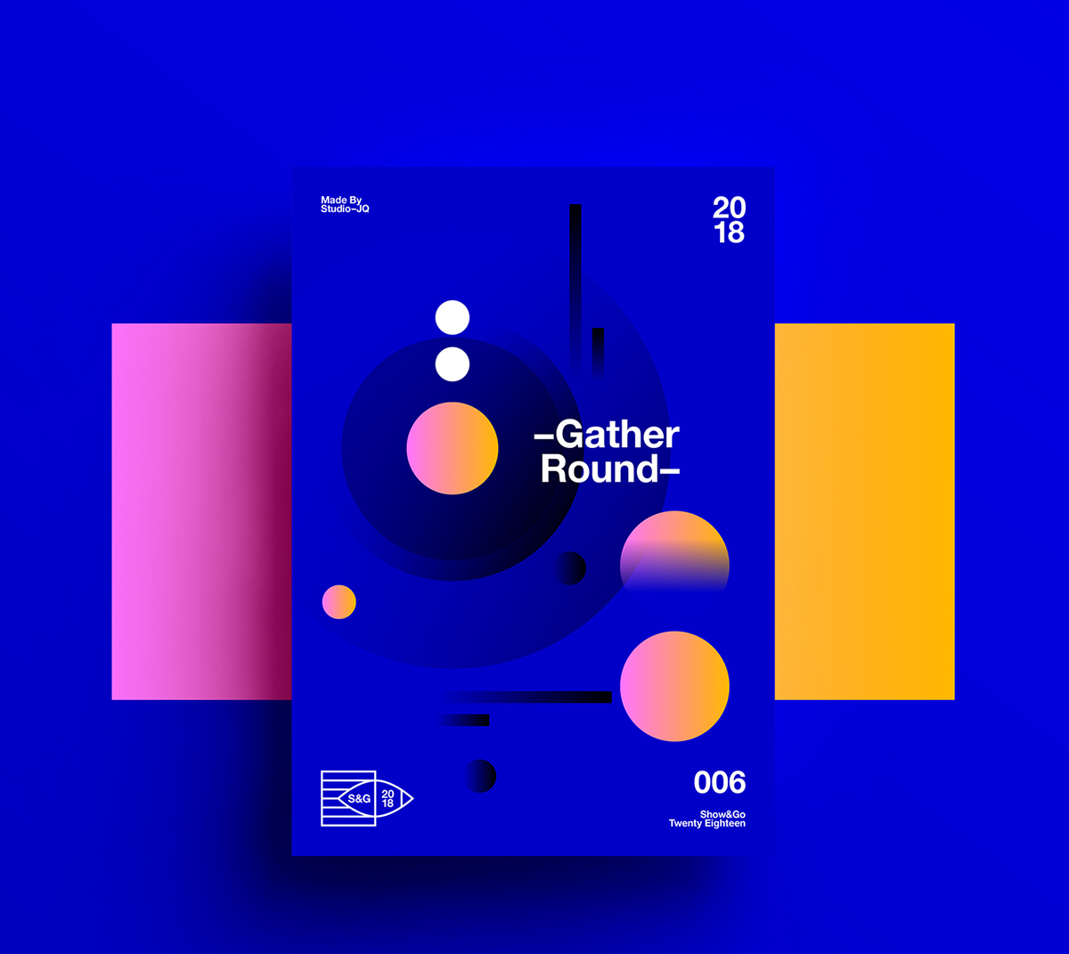
In 2017 we saw a surge in bold and brave colors and this trend is here to stay, making it one of the most important trends this year and probably in 2019 as well. With Ultraviolet taking over Millennial Pink, we will see some eye catching combinations, with intense colors creating some psychedelic designs.

 ———-
———-
Project: Show Go Poster Collection 2018 Author: ∆ Studio—JQ ∆
02.
Color of the Year 2018 (Pantone)
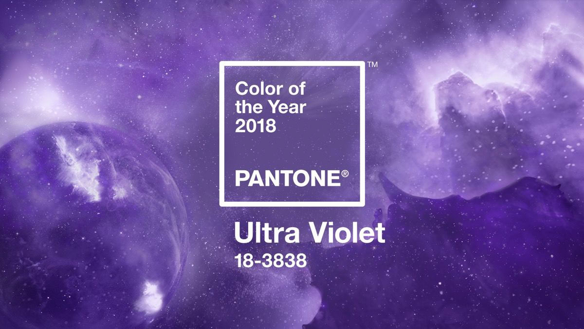
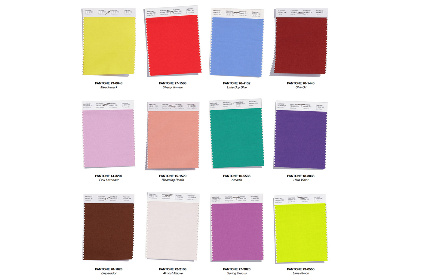
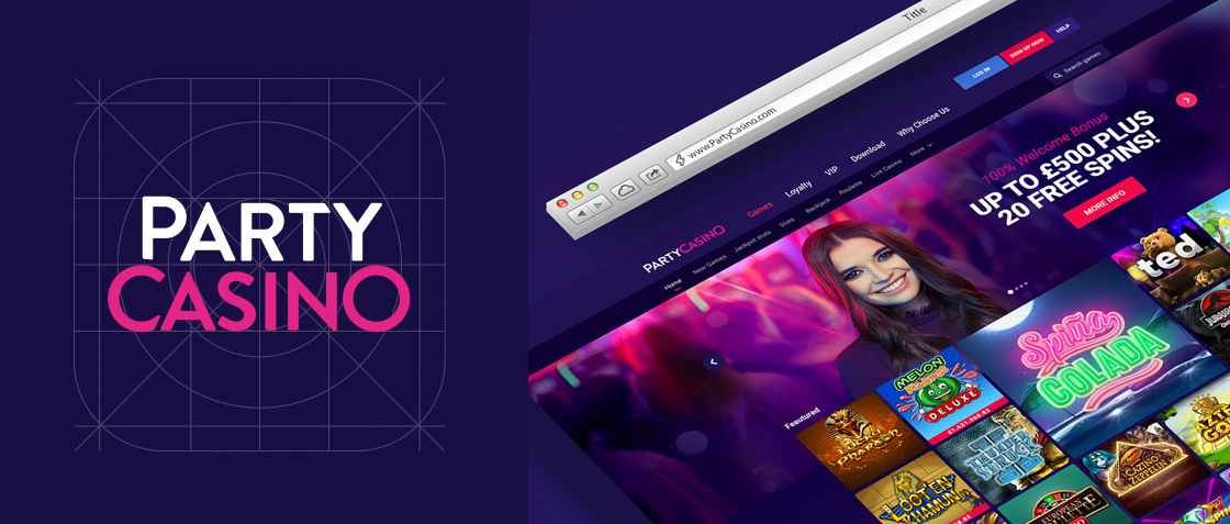
This year Pantone choose a few bright colors with Ultra Violet as a star color. All shades of lavender, violet and other purples will be very popular as well. Ultra Violet is a “blue-based purple that takes our awareness and potential to a higher level” and we just love it!
Big brands have already started to use violet for their brand identities.
Beside Ultra Violet, the colors that we personally love for this year are: Cherry tomato, Meadowlark, Lime Punch, Arcadia.


 ———-
———-
Project: Party Casino Rebrand
Author: PartyCasino Creative Team
03.
Gradients (Color transitions)
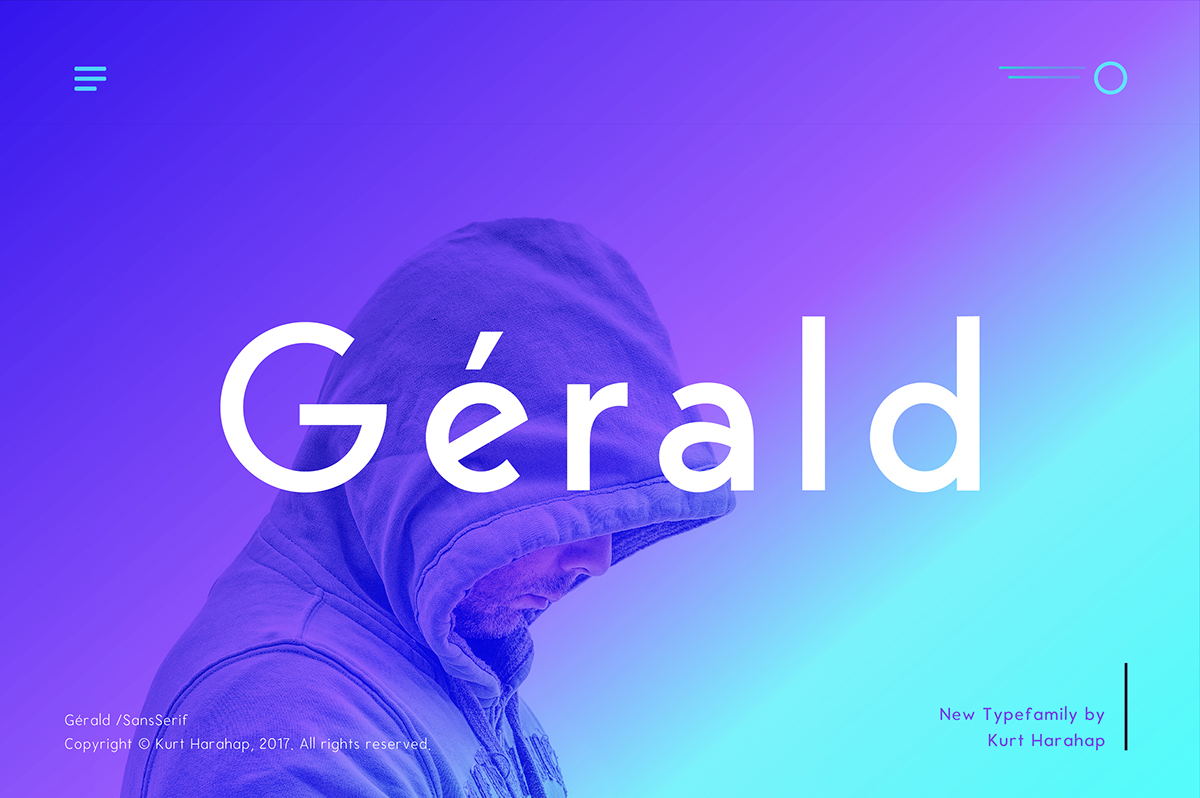
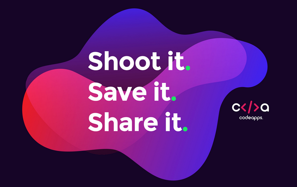
Gradient Color Transitions are a trend from 2017 but this year they will be bolder and bigger. Overlapping shapes or just a simple background can be a perfect choice for your project. In the last few months, gradients are popping up in all designs areas, from branding to packaging.
Gradient backgrounds, duotones gradients, multi-colors gradients, image overlays with gradients, subtle lines or stokes, in typography and logos or combined with flat elements – pick your favorite and go for it!
 ———-
———-
Project: Gerald Sans Geometric Font Author: NEWFLIX Bro
 ———-
———-
Project: Visual identity for CodeApps Author: Mariusz Mitkow
04.
Semi-flat design
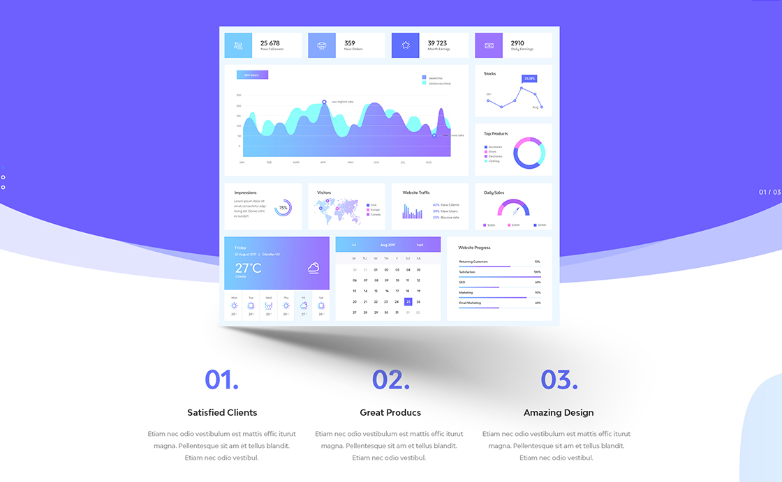
If you are a fan of clean and minimal design, then the semi-flat design is perfectly suited for you. Add more dimension to your project using subtle shadows to create depth, maybe some gradients or vibrant colors. The result will make your design more eye-catching and memorable.
 ———-
———-
Project: Doom massive all in one psd pack Author: Milo Themes

 ———-
———-
Project: Dribbbles iOS App Redesign Author: Tran Mau Tri Tam
05.
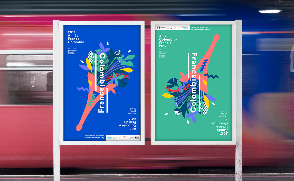
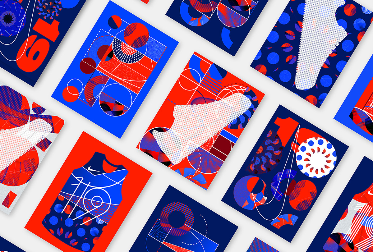
Geometric elements
Using geometric elements in design such as polygons (triangles, squares, and pentagons) or other shapes like curves such as the circle or the ellipse, can make your project unforgettable.
 ———-
———-
Project: France Colombia cultural season Brand design Author: Graphéine
 ———-
———-
Project: Nike Le Quartier Author: Atelier Irradié
06.
Duotones
Duotones are predicted to be one of the hottest trends in 2018. This is not a new technique in design, it actually exists for a few decades now, but Spotify has been credited to bringing it back to the mainstream. You can mix bold colors to create an unforgivable piece of design.

 ———-
———-
Project: Stranger Things -Concept UI UX Design Web Author: Manuel Rovira

 ———-
———-
Source: Spotify
07.
Brutalism
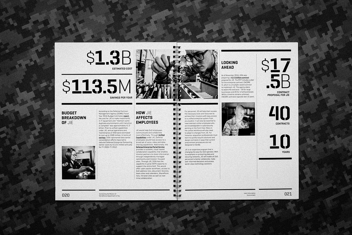
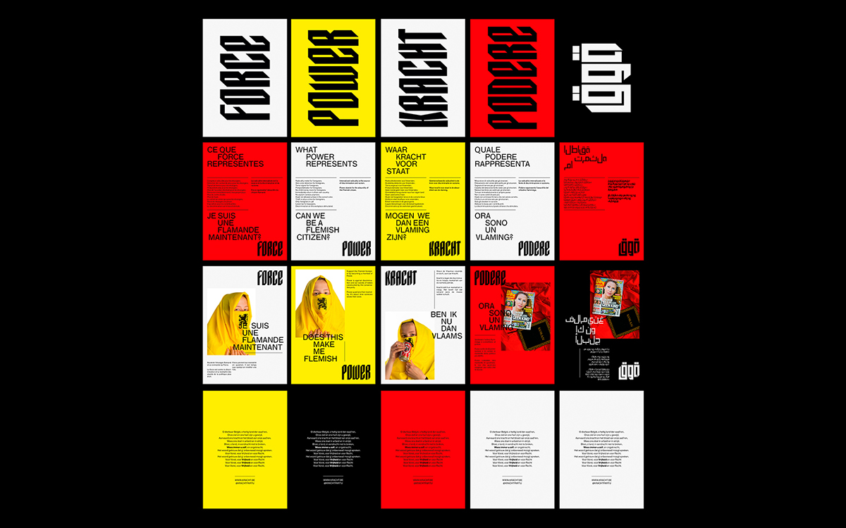
Brutalism is a rough concept that definitely grabs attention. Brutalism emerged in design in the 50’s and was used mainly on posters (it first appear as a trend in in 40’s in architecture), but now this raw concept it’s back and you will encounter it in all design fields. It is meant to shock the audience with its uncomfortable approach, clunky typography and unsubtle design techniques.
 ———-
———-
Project: DoD Cyber Guide Author: Marçal Prats
 ———-
———-
Project: Power A political party Author: Bruce Vansteenwinkel
08.
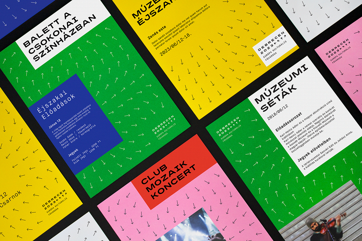
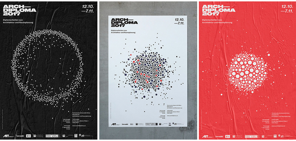
Generative Design
Generative design is present for a few years in identity design and we will see it all around 2018 as well.Combining colors and shapes this approach can create some unique design identity and bring the necessary recognition for a brand.
 ———-
———-
Project: Debrecen 2023 European Capital of Culture Author: Kiss József Gergely , Attila Ács , Fruzsina Fölföldi , Lili Köves , Classmate Studio

 ———-
———-
Project: Sydney School of Entrepreneurship Author: Olivia King , Jason Little , For The People , Johanna Roca , James Gilmore , Ben Walker
 ———-
———-
Project: Archdiploma Dynamic Identity Author: Process
09.
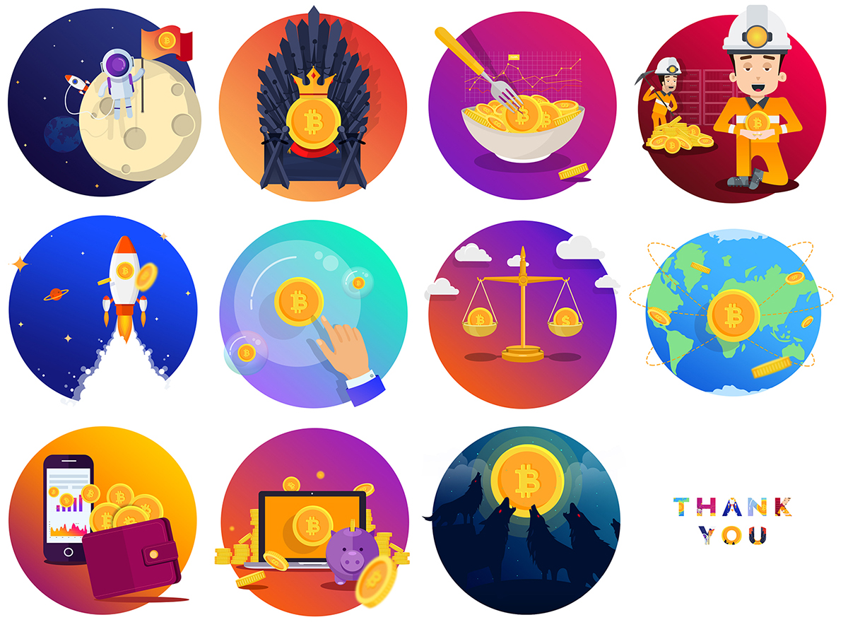
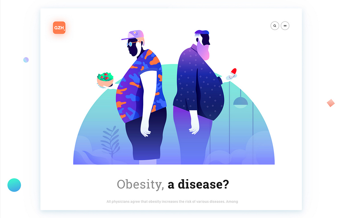
Custom Illustrations
Hand drawn illustrations or just simple elements, give a personal touch to a branding. Hand drawn elements don’t need to be polished, they can be rough shapes that add realness to the project.


———- ———-
Project: Selected illustrations 2017 Project: Serverless Conf
Author: justina lei Author: Romain Trystram
 ———-
———-
Project: Bitcoin Illustrations Freebies Author: Milo Themes , Loredana Papp-Dinea , Mihai Baldean
 ———-
———-
Project: Conceptual Illustrations GZH Product Design Author: Leo Natsume

 ———-
———-
Project: Selected Work 2017 Author: Adrián San Vicente
10.
Illustrations mixed with photography
An eclectic trend for 2018 is combining custom illustrations with photography. This technique gives a unique and very modern look to any project. Adding hand drawn elements to plain photography can make any photo stand out, even if you use it on fashion photography, conceptual or posters.

 ———-
———-
Project: Magazine covers Author: Andreea Robescu
11.
Patterns
Geometric patterns inspired from the 80’s and 90’s are back! Inspired by music posters, art, movies and fashion all from the 80’s this patterns will rock the design world this year. Bold colors are a must in this trend.

 ———- ———-
Project: Yes To All Project: LOGOFOLIO 2017
Author: Nick Liefhebber Author: 268 Estúdio Design

 ———-
———-
Project: Outline Montreal Masks
Author: Patrick Seymour , BÜRO UFHO .
12.
Smooth animations and GIF\’s
From websites, logos, presentation videos for products or services, motion graphic is everywhere. A great trend in motion graphics are the seamless transitions, that can make people better understand your product. Motion graphic is present in typography as well, from a bold statement on a slider to an animated logo.

 ———-
———-
Project: RED
Author: Kevin Hou
13.
Genuine and real Photography
Stock photography is influenced by trends as well. This year real, honest photography will rule. As many big brands started using unique captures, with movement and surprise elements, the photos will we more genuine, like a snapshot, with a relaxed and authentic approach.

 ———-
———-
Source: unsplash
14.
Architectural Inspiration
The minimalism of modern architecture is inspiring the world of design as well. The geometric abstraction, with sharp edges and straight angles can be found in design projects such as websites, posters or identity design.

 ———-
———-
Project: Jewish Culture Days Berlin 2017
Author: Any Studio
15.
Mix of 2D and 3D
Creating 3d objects and place them in 2d projects is really hot right now. This mix creates some unique visual aesthetic by combining depth with flatness. This technique can be used on various design fields from logos, to websites or presentation videos. The end result is a complex visual presentation that will certainly be remembered.
16.
One Color
This past few months we’ve seen many one color designs, with the same background color as the product presented or the typography shown and using shadows or 3d effects to create volume.

 ———-
———-
Project: H&M
17.
Doodles (hand drawn illustrations)
Hand drawn illustrations or just simple elements, give a personal touch to a branding. Hand drawn elements don’t need to be polished, they can be rough shapes that add realness to the project.

 ———- ———-
Project: Toasted Pets Project: Art Hub Bahrain Packaging
Author: Brosmind ® Author: Elias Madan

 ———-
———-
Project: Awake Festival Proposal Author: Milo Themes , Loredana Papp-Dinea , Mihai Baldean
18.
Styles crossing and merging
From illustration combined with photography, typography with photos, Gradients with bold typo, duotones with bright colors, combine 2, 3 or even more 2018 trends to get an eclectic and memorable design.

 ———-
———-
Project: Styled Social Media kit Author: Maksat Amirzhanuly
Logo Design
19.
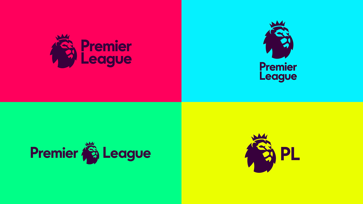
Responsive Logos
In a responsive world adapting your logo to any device is vital. A truly responsive logo doesn’t just shrink on a page/device, it needs a subtle adaptation and to be flexible to the context is been showed on.
 ———- Authors: Design Studio
20.
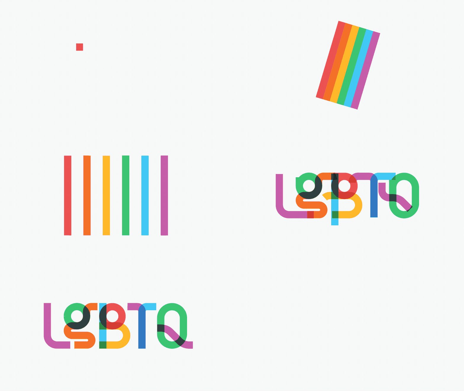
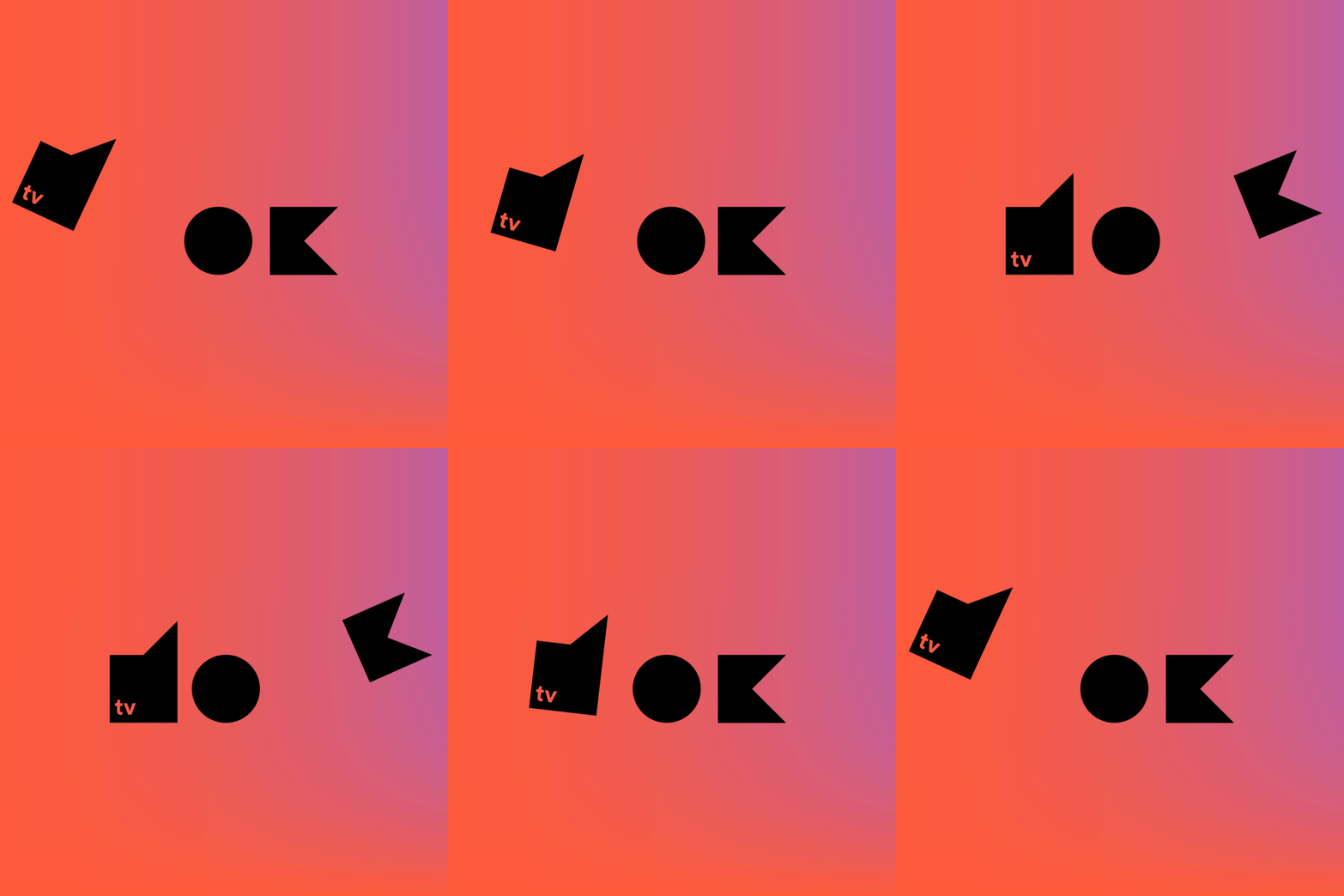
Animated Logos
Animated logos have been around for a while, but recently they are popping up in almost any presentation. An animated logo can depict a brand’s story and have a better conversion rate as it’s memorable.
 ———-
———-
Project: Type With Pride Gilbert font Author: Fontself Team , Akiko Nakashima , Justin Au , Robyn Makinson , Chris Rowson , Bastien Baumann
 ———-
———-
Project: DOCTV Author: Beetroot Design ———-
Project: Logo Visual identity Author: Mariusz Mitkow , Patryk Chlabicz
21.
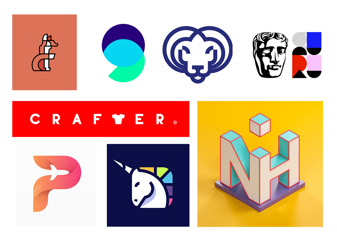
Colorful & Fun Logos
Colorful logos with funny elements, animations and custom illustrations are a big trend this year. Most brands want to send a positive message to the customers so a fun approach is the way to go.
 ———- Authors: Axel Flores, Vladimir Lifanov , Silvestri Thierry , Vadim Carazan , Onrepeat Studio , Serafim Mendes
22.
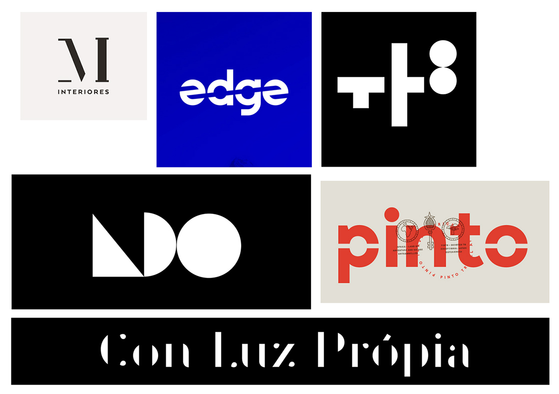
Negative space
Negative space is still a hot pick logo design. We’ve seen a lot of this trend in the latest years but it’s still rocking hard the design world. In the last years designers used negative space for a minimalistic feeling but the novelty this year is that the white space is field with bold colors and geometric patterns and elements.
 ———-
———-
Authors: SeisTrece Studio , Vadim Carazan , Quim Marin , Bureau Rabensteiner,
Andrei Traista
23.
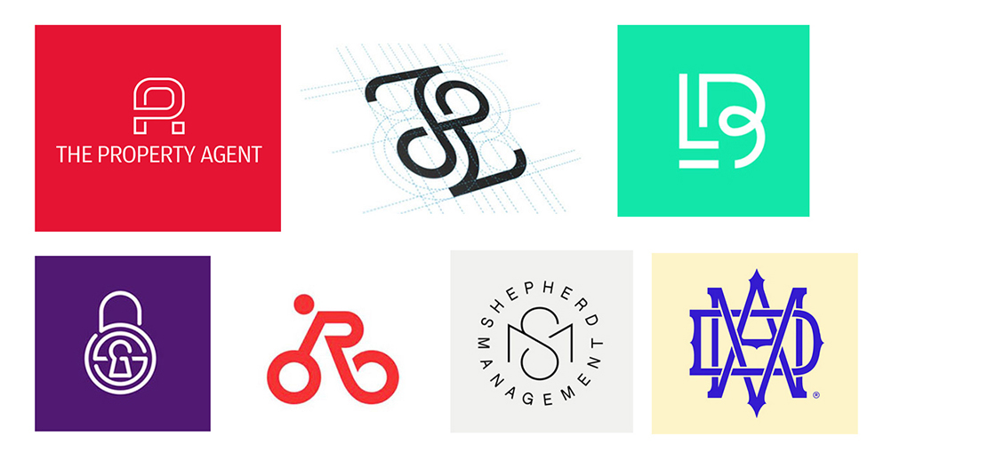
Monograms
Monograms will never fade in logo design. They are a way to create stability, emanate quality and tradition in a brand. Monograms can also be created using a more modern approach by mixing some modern trends from this year as the bright colors, duotones or geometric patterns.
 ———- Authors: Milo Themes , Romain Billaud ,
24.
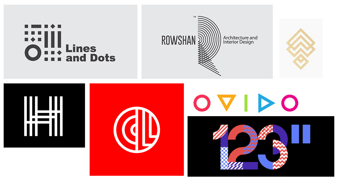
Geometric shapes & patterns
Adding a custom made subtle pattern to a logo can make a bold statement about the brand. The minimal geometric shapes can bring versatility and originality to a logo, so we will definitely see more of them in 2018.
 ———- Authors: islam biko , Quim Marin , Silvestri Thierry , Vadim Carazan
25.
Gradients
As you probably already know gradients are one of the biggest trends inherited from 2016-2017 and, of course, this trend will be present in logo design as well. Subtle touches of gradients or bold statements transitions, which one do you prefer?

 ———- Authors: MICHAEL SPITZ , Nicholas Slater , Jeroen van Eerden , Vadim Carazan
26.
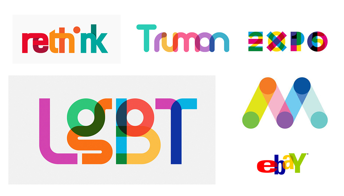
Overlaps
With the duotone trend rising this year, overlapping elements are really hot in logo design. Take a look at our picks.
 ———-
———-
Authors: CaveLantern . , Fontself Team , Rosie Manning
Packaging Design
27.
Flat Design
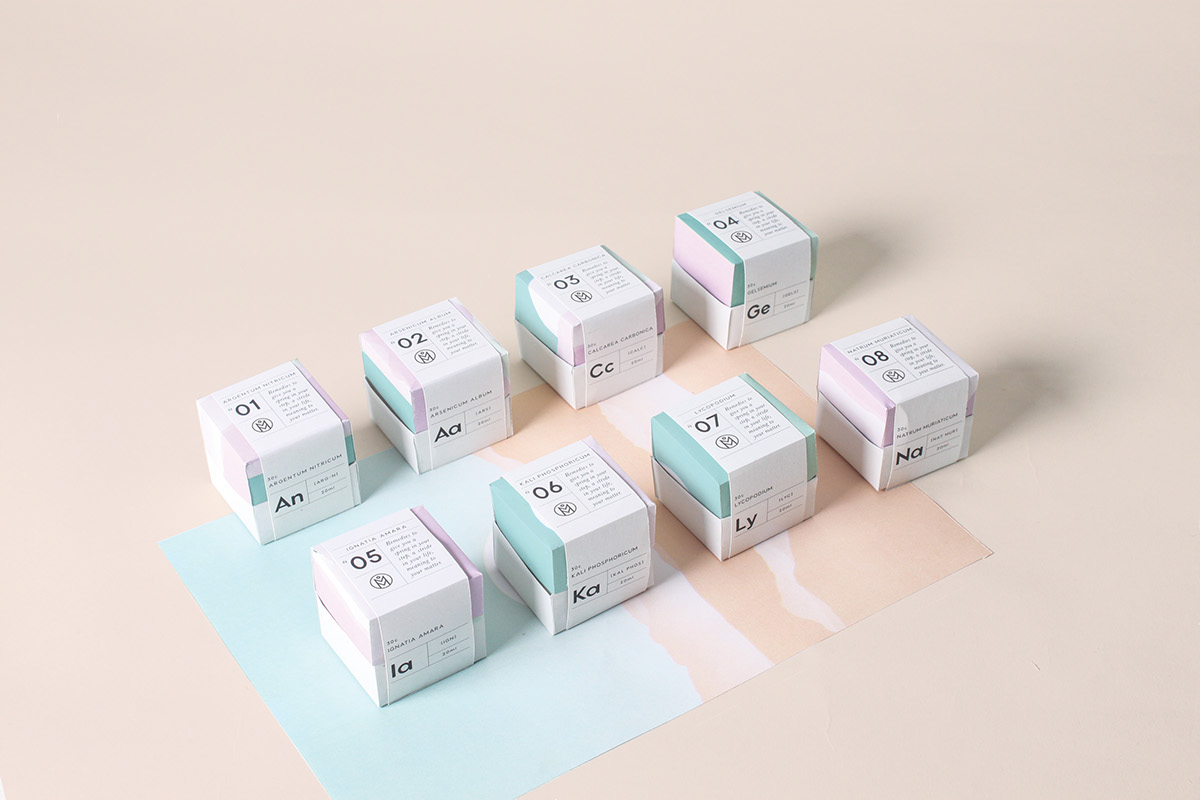
Flat design is still the it choice to make when it comes to packaging design. Flat shapes, patterns or custom illustrations is the way to go in 2018.

 ———-
———-
Project: Cheddar-Cheese-Melt-Mcdonalds-Packaging Author: Mostafa Abdelmawla

 ———-
———-
Project:The-Gang Author: Mustafa Akülker , Juan Tide , Onur Ucar , Duygu Erdem , MARKA NETWORK
 ———-
———-
Project: Melio Author: Rachael Batley
28.
Minimal Design
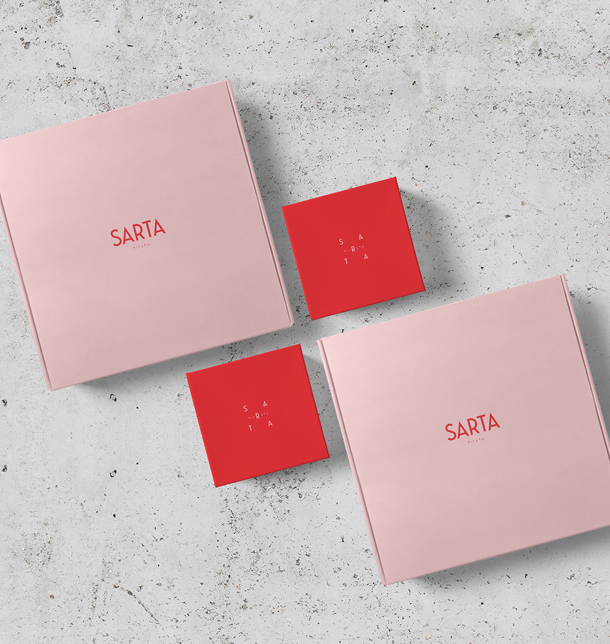
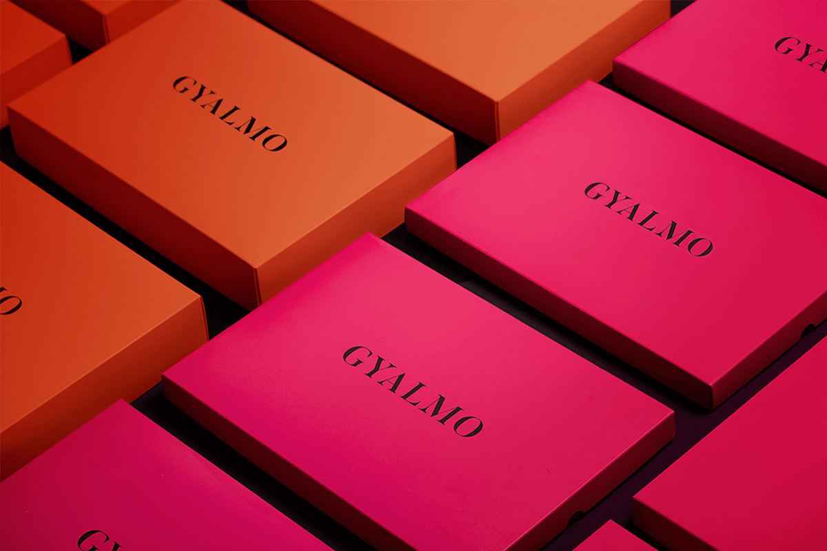
Over-Crowded design is a thing of the past, as a result all the non-essential information must go and make room for the relevant ones. This trend uses a lot of negative space so the consumer will only interact with the necessary info.
 ———-
———-
Project: Sarta-Milano Author: Mustafa Akülker , Juan Tide , Onur Ucar , Duygu Erdem , MARKA NETWORK
 ———-
———-
Project: Gyalmo Author: Marysia Markowska , Łobzowska Studio
29.
Patterns & Shapes
Geometric
We will encounter geometric shapes in all design branches. Choose a geometric pattern that fits your product and go for it!

 ———-
———-
Project: DLIGHT beer cocktails Author: Gintare Marcin , Valerija Zileniene , Irmantas Savulionis

 ———-
———-
Project: NICHE-Tea Author: IWANT design
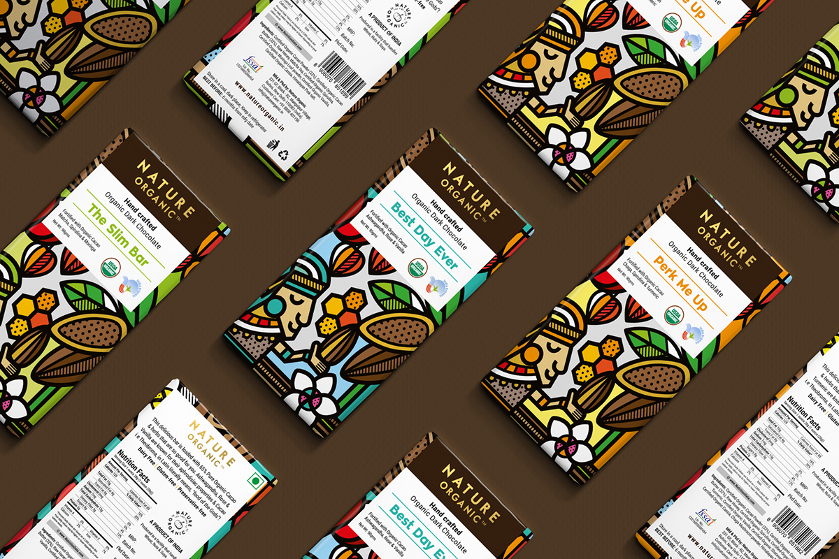
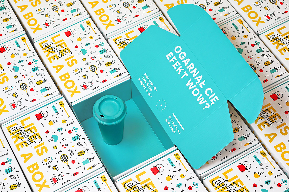
Custom shapes and elements
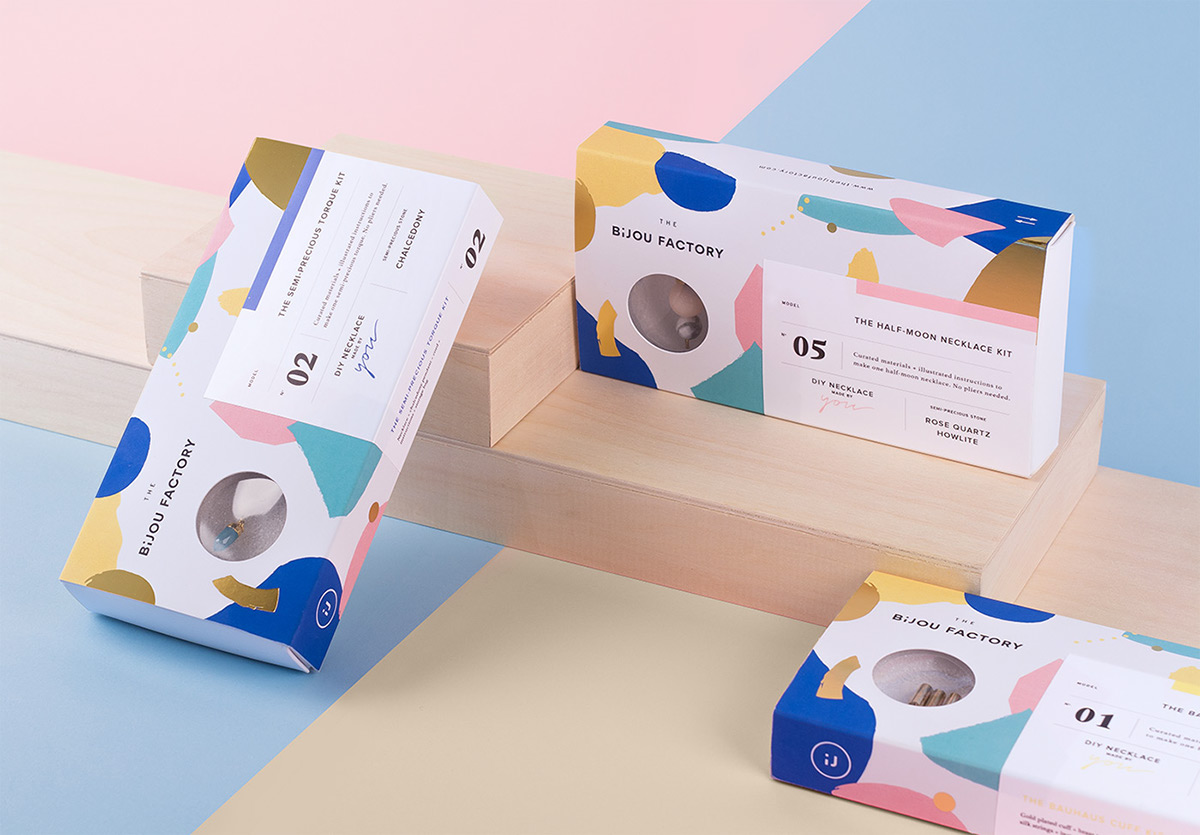
Custom made design is mandatory for a unique brand identity.
 ———-
———-
Project: The Bijou Factory Author: Phoenix The Creative Studio , Alexis Malin , Anthony Morell , Louis Paquet ,Clément Piganeau
 ———-
———-
Project: Nature Organic Chocolates Author: Mike Karolos
 ———-
———-
Project: aleFanty Author: less . Anna Holik , Martyna Wędzicka-Obuchowicz , Gosia Perkowska

 ———-
———-
Project: Resonance Author: Lucas Wakamatsu
Doodles
Doodles are a fresh trend this year in all design fields and identity design is perfect to create this brave patterns. Onto a package, doodle can transform a plain and dull design into a fun, unique piece of art.

 ———-
———-
Project: Misfitjuicery

 ———-
———-
Project: Zoe-Juices Author: Beetroot Design
Vintage
Vintage patterns are still in even if they are around for a few years now. Vintage design can relate to a certain level of quality, with tradition in mind. Vintage design is based on details and can create a long lasting brand identity.

 ———-
———-
Project: Mutti Special Edition for FICO Eataly World Author: Auge Design , Giovanni Stillittano

 ———-
———-
Project: A PIECE OF LOVELY CAKE Puff Pastry Package Design Author: 张 千里 , 许 铃铃
30.
Bold Typography
Bold typography sends a strong and clear message. If you like your product to stand out, use a big typo and combine it with a bold color.

 ———-
———-
Project: Refresh Author: Sergey Golodyaev , Nastia Jey

 ———-
———-
Project: Amilk & Adidas Author: Duy Dao , Kristen Chon
31.
The Colors
Bold Colors
Bold colors are the stars this year so we will found them in packaging design as well. Combined with crazy patterns and geometric shapes, brave colors can add a fresh feeling to any product.

 ———-
———-
Project: Deker-rebranding Author: less . Anna Holik , Martyna Wędzicka-Obuchowicz , Gosia Perkowska

 ———-
———-
Project: Mochila Author: Sweety & Co.

 ———-
———-
Project: The Pizza Affair Author: Futura .
Pastel Colors
Pastel colors are a response to the bold color trend that is taking more and more space into packaging as well. The soft tones are a great choice if you want to transmit a warm message to the customers.

 ———- ———-
Project: Majka Project: Freshly Baked Author: Futura . Author: Design Happy

 ———-
———-
Project: Ela cosmetics Author: ChocoToy cute
32.
Unusual materials & shapes
From transparent to metal, anything is allowed in packaging design. With so many products on the shelf, a truly innovative package needs to stand out and be remembered. The use of unusual materials to create modern, forward looking products is a must for a designer.

 ———- ———-
Project: Sprout Green Paulownia Wooden Box Project: Eco bamboo tooth brush Author: 應爵 Yinjue Author: Margas Family
33.
Holographic effects
The holographic effect is an old trend that is emerging again in this time period. The metallic materials used give a futuristic effect and can create a magic, eye catching design.

 ———-
———-
Project: EAT ME Author: Maria Otrutckaya , Anastasia Bogatkova , PACKVISION AGENCY

 ———-
———-
Project: Sphynx Author: Anagrama Studio
34.
Gradients in packaging
As we already stated this is one of the biggest trends this year as well and it can be found plenty in packaging design. Add soft gradients to create depth or use vibrant colors for a bold statement.


 ———-
———-
Project: YOU OIL natural cosmetics Author: Valerija Zileniene , Algirdas Orantas , Irmantas Savulionis
Web design (Ui/Ux)
35.
Mobile First
It’s no news that mobile browsing surpassed desktop. With dynamic icons, menus, submenus, all designers take mobile into consideration.

 ———-
———-
Project: Food Drinks app Interaction Collection Author: Johny vino™ .

 ———-
———-
Project: Mileage Tracker Website Application Design Author: Stanislav Hristov
36.
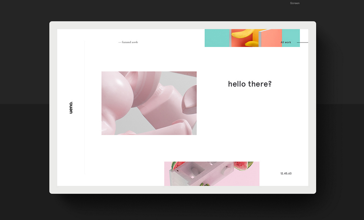
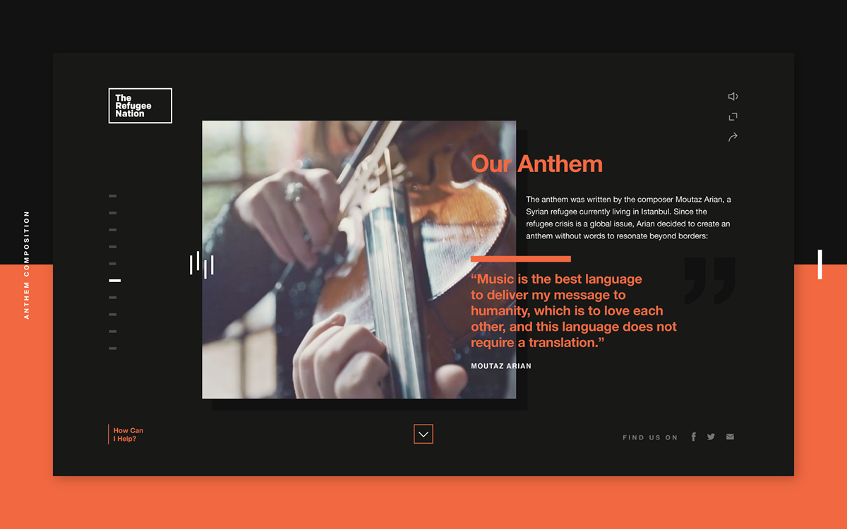
Broken grid layouts
Some designers feel constrained by the classic grid so they try to break the rules and set free their creativity. With images and text overlapping and converging breaking the grid can create some unique, experimental designs.
 ———-
———-
Project: Ueno Concepts Author: Ben Mingo
 ———-
———-
Project: The Refugee Nation Web Design Branding Author: Justin Au , Bastien Baumann
37.
Integrated animations
The use of animations is a great tool for your users to know the brand’s story, it’s interactive and fun and they are creating a unique experience for the visitors. Animations can be integrated to work with page transitions.

 ———-
———-
Project: Corporate Website LitsLink Author: Elena Galitsky , Max Balter , Bachoo Design Studio

 ———-
———-
Project: Unight Author: Stan Yakusevich , Senya Ars , Vladimir Gruev , Mind Studios
38.
Custom Illustrations
In 2018 we will continue to see an all new rise of illustrations in web design. With big brands using custom illustrations into their re-branding, this trend will spread really fast. Digital and traditional artists can make custom illustrations that are well tailored to suit any business and address their target customers.

 ———-
———-
Project: Lifecycle Author: Iswanto Arif , puji ari setiawan , Ghani Pradita , Sole Chan , Paperpillar Studio

 ———-
———-
Project: Illustrations for Koypo Industries Author: Milo Themes
39.
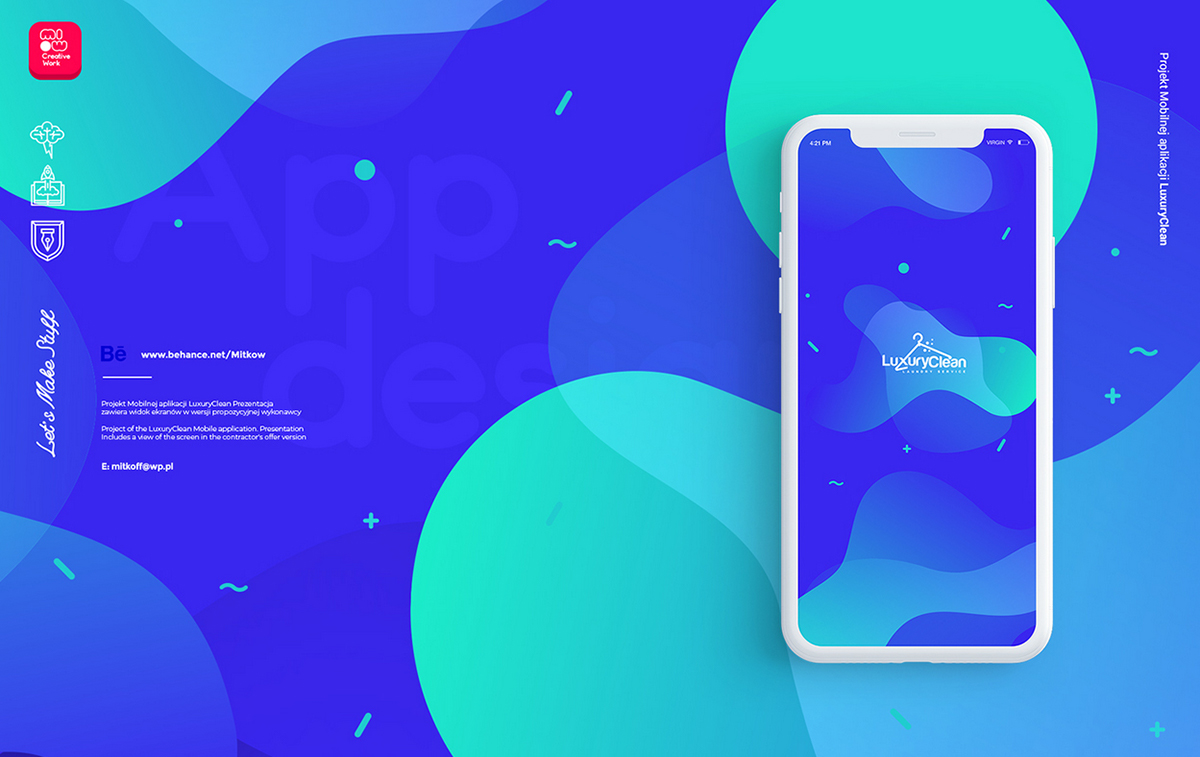
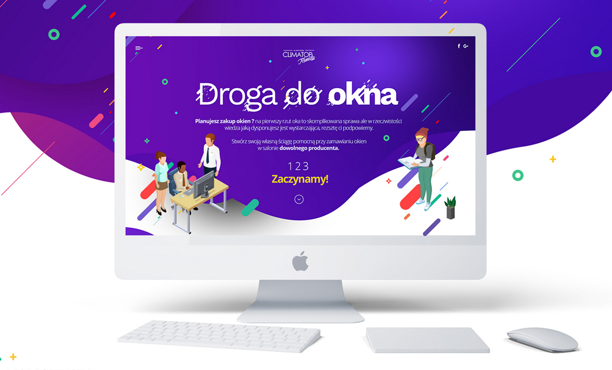
Round corners & fluid shapes
In the last few years, web design was dominated by right angles and sharped edged geometric shapes. For the last few months the rounded curves and fluid shapes have been taking over. Combined with fresh colors and overlays this trend is here to stay.

 ———-
———-
Project: Doom massive all in one psd pack Author: Milo Themes
 ———-
———-
Project: LuxuryClean UIUX iOS App Author: Mariusz Mitkow , Patryk Chlabicz
 ———-
———-
Project: Landing page project design Author: Mariusz Mitkow
40.
Parallax scrolling
Parallax scrolling has become so mainstream that you cannot deny it’s popularity. With scrolling dictating the animations speed, your imagination is the limit.

 ———- Project: Dex Multi-Layer Parallax Author: Milo Themes
Typography
41.
3D Modeling
3d is a powerful trend taking over all design fields. 3D rendered typography can bring a real life effect to your composition.

 ———- Project: Atypical Author: Pawel Nolbert

 ———- Project: Alphabet Project Author: Serafim Mendes

 ———- Project: RE NEON vI Author: Omar. Aqil
42.
Bold Typography
Bold typography was a big trend in the last years and it’s definitely here to stay. In 2018 we will see much bolder typography combined with bright colors. So remember, if you want to make a strong statement, bold typography is the way to go.

 ———- Project: Club AVis XII Anniversary Posters Series Author: Milo Theme

 ———- Project: TEDxGroningen Author: Rudmer van Hulzen
43.
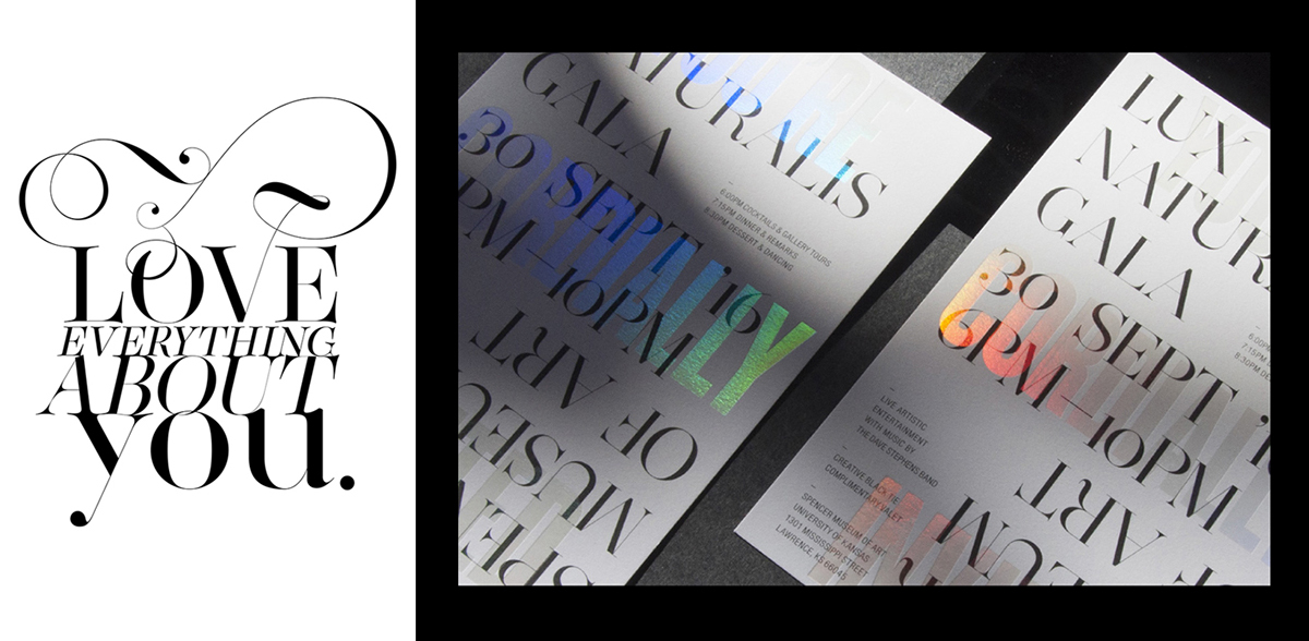
Serif Fonts
In the last years, typography was dominated sans serif fonts but in the last few months we’ve seen serif fonts making a comeback. Here are a few interesting projects that choose to use serif fonts and did an amazing job.
 ———- ———-
Project: Custom Type Design Project: Lux Naturalis Gala Invitation Author: Moshik Nadav Typography Author: Rachel Roth
44.
Geometric Type
Geometric fonts were really relevant in the last years and will continue to be an important trend in 2018 as well. Geometric fonts can bring unicity and a futuristic feeling to any project.

 ———- ———-
Project: VitrineMedia Project: Sydney School of Entrepreneurship Author: Graphéine Author: For The People
45.
Custom Fonts
Custom fonts require time and money but the result is unique, easy to spot and remember. If what you are searching for is individuality and unicity, then a custom typeface can highlight that.

 ———- Project: Mazura typeface Author: Official Classic

 ———- Project: Lingerie XO The Sexiest Most Powerful Typeface Yet Author: Moshik Nadav Typography
46.
Bold alignment and kerning
Chaotic typography was one of the main trends for 2017 and it’s still ruling in 2018. Forget about the grid and let your creativity run free!

 ———- ———- ———-
Project: Studio Studio Project: ORGULLO Project: Musikk Author: Rudmer van Hulzen Author: Koln Studio Author: Non-Format
47.
Experimental Typography
A designer should experiment with fonts and typeface and come up with cutting age results. Mixing pre-made fonts with negative space or custom elements, the results can be amazing.

 ———- Project: Experimental Chinese Typography Taiwan Indie Music Author: Letitia Lin
48.
Typography with real life elements
Eclectic trends are always hot and we just love this one. Integrate bold typography in real photography or 3d renders for some avant-garde outcomes.


3D Renders
49.
Abstract shapes
3d abstract shapes combined with bold colors is a winner mix this year. This is definitely one of the most influential trend this year so keep an eye on it.

 ———-
———-
Project: Logitech CRAFT Author: Pawel Nolbert

 ———-
———-
Project: SWEET SPIRALS Author: Kirill Maksimchuk
50.
Metallic 3D renders
The metallic 3d renders are truly glamorous and it’s definitely a trend worth watching in 2018.

 ———-
———-
Project: INDITEX Happy New Year Author: T A V O .

 ———-
———-
Project: NIKE FC 3D Golden balls in the real world Author: T A V O .
51.
Motion 3D graphics
As animations conquers the design world, 3d motion graphics is definitely something worth watching this year. Combined with audio this kind of animations will rule multimedia projects. Using visual effects and other cinematic techniques, the motion designer can bring life to 3d characters and typography to better understand the product’s identity. ———-
Project: NIKOPICTO SHOWREEL 2018 Author: Nikopicto .
- 请注意,下载的资源可能包含广告宣传。本站不对此提供任何担保,请用户自行甄别。
- 任何资源严禁网盘中解压缩,一经发现删除会员资格封禁IP,感谢配合。
- 压缩格式:支持 Zip、7z、Rar 等常见格式。请注意,下载后部分资源可能需要更改扩展名才能成功解压。
- 本站用户禁止分享任何违反国家法律规定的相关影像资料。
- 内容来源于网络,如若本站内容侵犯了原著者的合法权益,可联系我们进行处理,联系微信:a-000000
📝留言定制 (0)