2016UI和色彩灵感
Nike Free Flyknit – microsite concept by Christian Vizcarra Cabrera in Brazil
This is Christian’s microsite concept for nike fit to fly, a single thread knitted constructed shoe upper that provides a second skin feel when worn. Try to say that 5 times fast. Christian states “My idea is to create a minimal website with hight impact visuals and a better experience for the users”.
See the full work via Behance


Nike Tech Pack in store app by Shakir Dzheyranov Luis Liwag in the USA
If new color use is your thing then this piece is sure to please. Nike Tech Book is described as “a shoppable lookbook that takes you behind the design and inside the innovation to give you unparalleled access to the season’s best.”
See the full work via Behance


Star Wars: Force University by Fernando Baez, Pablo Chico and Carlos Pariente A. in Spain
What would happen if Jedis & Siths were able to study at University? This is the result. This is a concept project.
See the full work via Behance


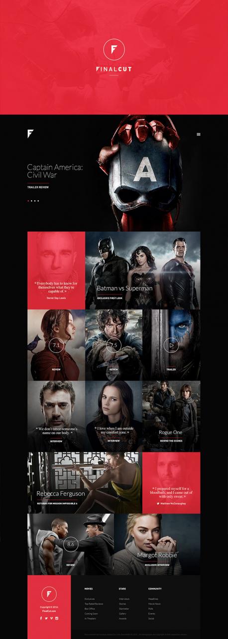
FinalCut by Loris Stavrinides in Cyprus
Loris does a great job in this concept design for an online magazine portal about the world of movie blockbusters, stars and big screen news.
See the full work via Behance

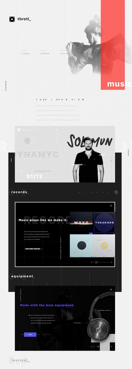
Throtl_ music festival website by Sefik Skejic in Bosnia and Herzegovina
A full website experience design for a music producing and event organizing company ( throtl_ ). Cool name, cool visuals.
See the full work via Behance

SHOE GURU Shop by Pawel Skupien in Poland Jablonski Marketing in Canada
SHOE GURU Shop. No details given but it\’s pretty self-explanatory and very nicely executed.
See the full work via Behance


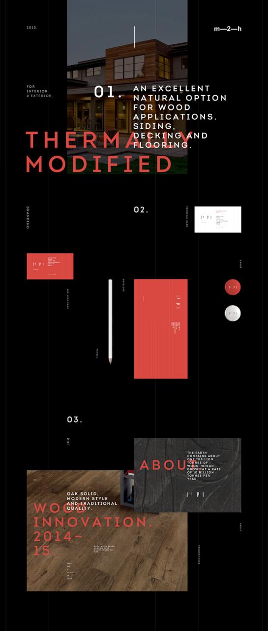
Long Life Wood by Alexander Laguta Alex Smolkin in Russia
Some very on-trend work for Long Life Wood — a manufacturer of thermally solid wood flooring, decking, cladding and other wood products.
See the full work via Behance

Craigslist redesign concept 2016 by Aurelien Salomon in Canada
A visual redesign of Craigslist done for fun. If only…
See the full work via Behance


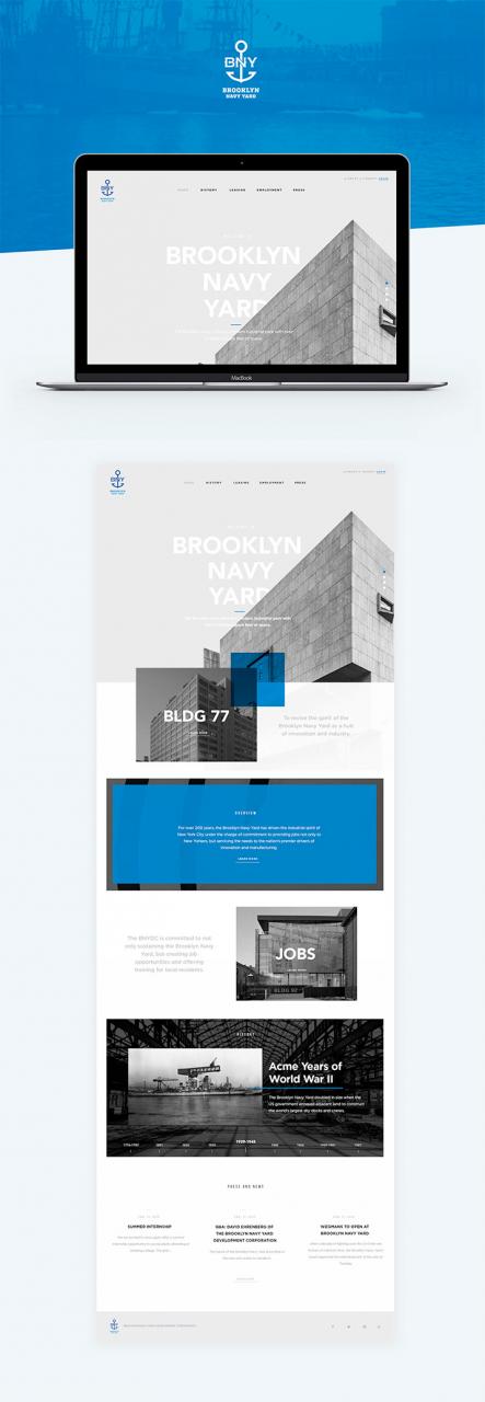
BNY by Chris Novaks Andreas S in the USA
A design pitch for Brooklyn Navy Yard that made the cut thanks to clean and contemporary design.
See the full work via Behance

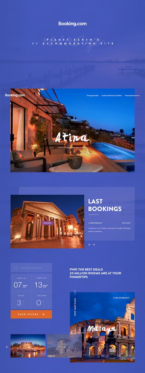
Booking.com | redesign concept by Yalcin Ozgan in Turkey
Redesign booking.com website. This is a personal project very tastefully performed by Yalcin.
See the full work via Behance

Inty by Alexander Laguta Alex Smolkin in Russia
Inty is an interactive installations and presentations studio. The Inty team have created a full set of tools, guidelines, branding elements and animation based on a hero of whitespace. Excellent job.
See the full work via Behance
Project tri – g by tri – g in South Korea
Tri – g offers no explanation of project 8, choosing to simply say thank you! No… thank you tri – g.
See the full work via Behance


- 请注意,下载的资源可能包含广告宣传。本站不对此提供任何担保,请用户自行甄别。
- 任何资源严禁网盘中解压缩,一经发现删除会员资格封禁IP,感谢配合。
- 压缩格式:支持 Zip、7z、Rar 等常见格式。请注意,下载后部分资源可能需要更改扩展名才能成功解压。
- 本站用户禁止分享任何违反国家法律规定的相关影像资料。
- 内容来源于网络,如若本站内容侵犯了原著者的合法权益,可联系我们进行处理,联系微信:a-000000


📝留言定制 (0)